Work / Case studies

Taking brand decisions out into the world.

Eight concept projects for food and drink brands, showing how brand principles extend to product, store, street and film.

00 / Concept work · Small-batch ice cream

THE WEEKEND CREAMERY

Starting from a colour for each flavour, we carried the same criteria into product, store, street and film.

In shortOne colour rule for product, shop, street and film.

* Not a client project. A demonstration of our brand design method.
brand systemf&bretailfilm
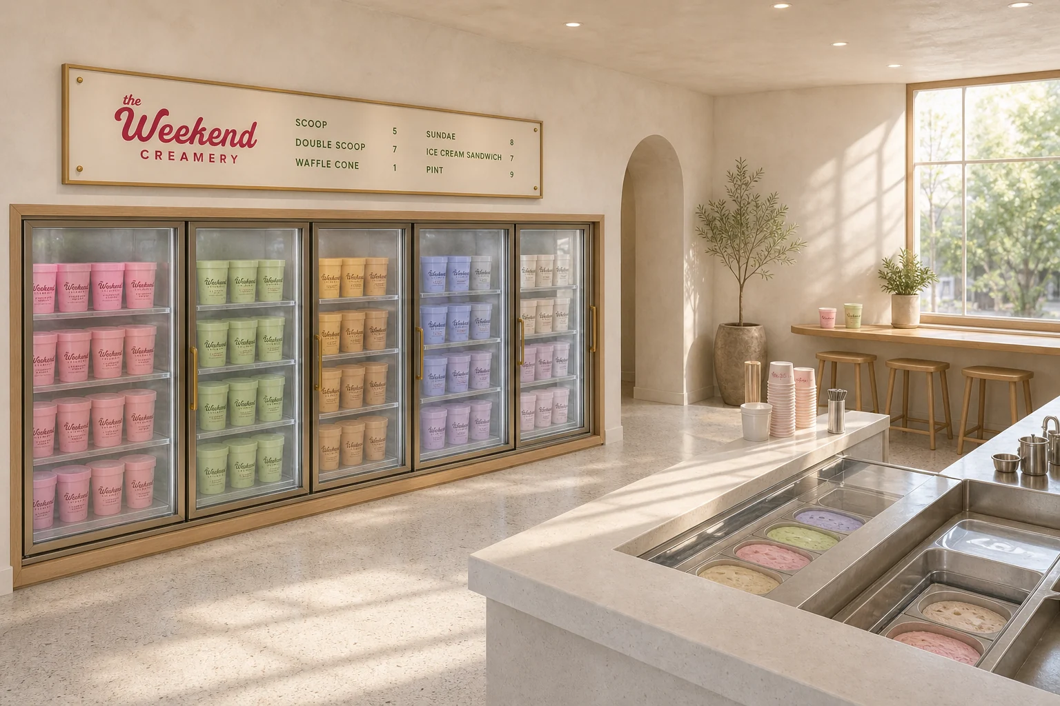
Inside THE WEEKEND CREAMERY: a freezer case of pints lined up by flavour colour and a bright marble counter
Key visualSee 4 touchpoints in the details
Case breakdown / 4 touchpointsThe film and 4 touchpointsOpen detailsClose
ONLY SHE MOVESFilm / 21.99 sec
The system

Make the flavour the colour.

You can choose by colour before you read the flavour name. The colour rule set by eight pints repeats with the same precision across the freezer case, cups, cone sleeves and shop signs. The film captures the moment that quiet system becomes a story through people moving.
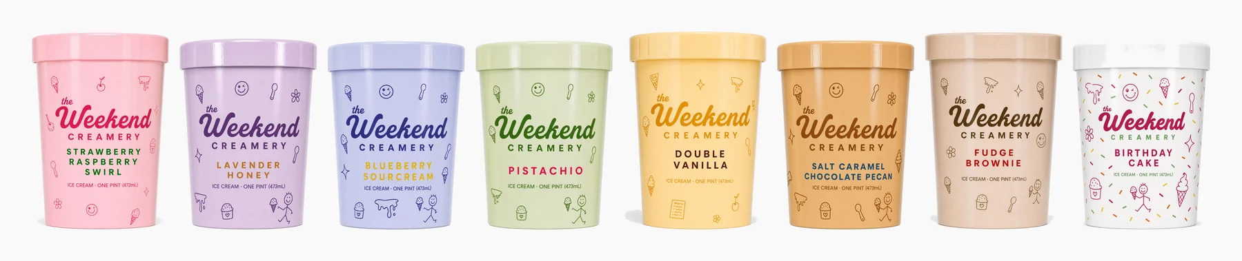
Product line-up of eight THE WEEKEND CREAMERY pints in flavour colours
01 / Product system — the colour is the menu
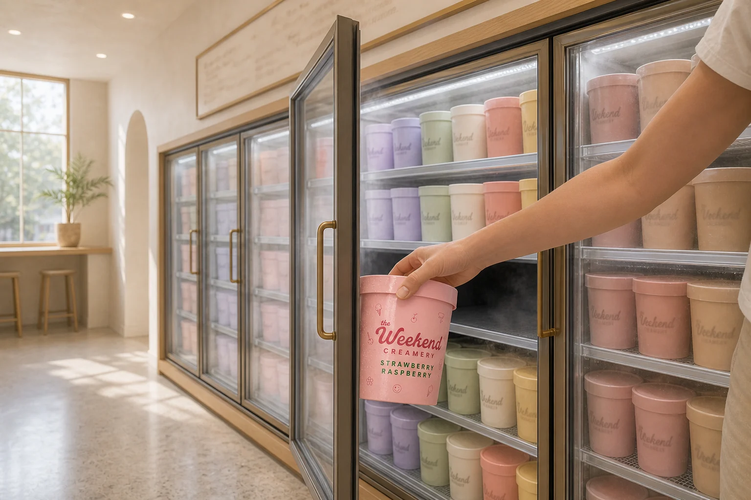
A pint being taken from a glass-door freezer case where pints are arranged by flavour colour
02 / Retail system — a wall read by colour
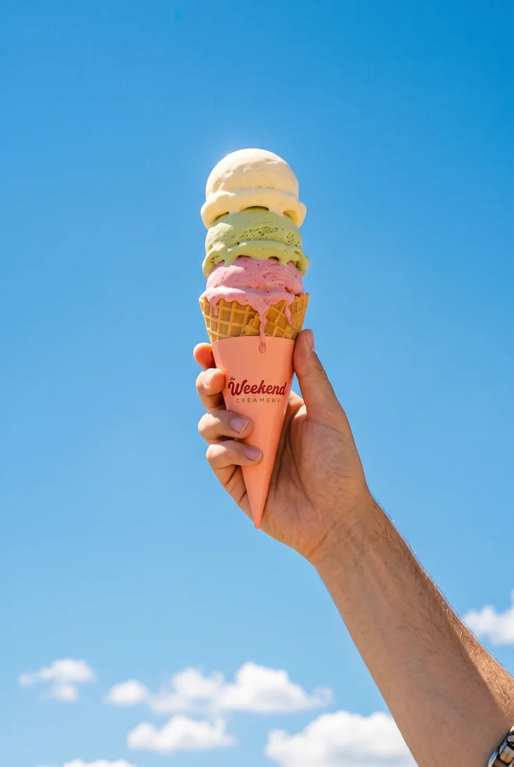
A hand raising a triple-scoop cone in a coral sleeve against a blue sky
03 / Hand — three flavours, one gesture
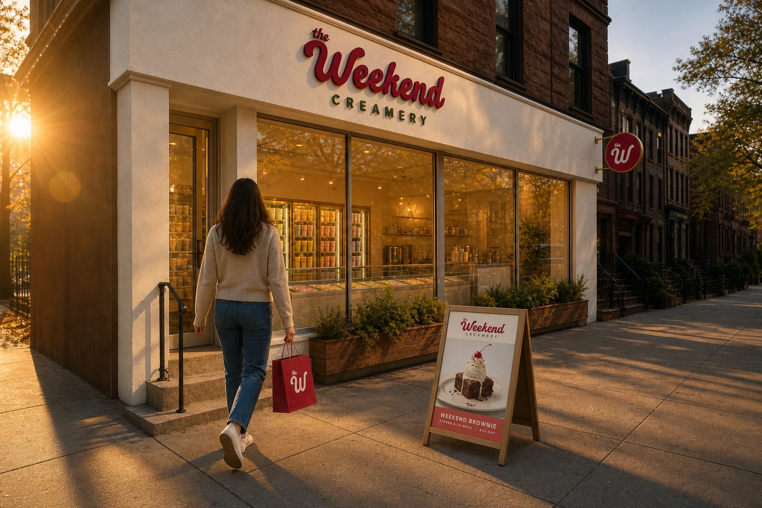
THE WEEKEND CREAMERY shop on a street corner at golden hour, with its sign and customers holding products
04 / Street — the system leaves the shop
01 / Concept work · Salt bread bakery

SALTY BUDDY BAKERY

Starting from baking times, we carried the same criteria into product, kitchen, storefront, street and film.

In shortOne time rule for product, kitchen, storefront and street.

* Not a client project. A demonstration of our brand design method.

brand systembakerytime-ledfilm
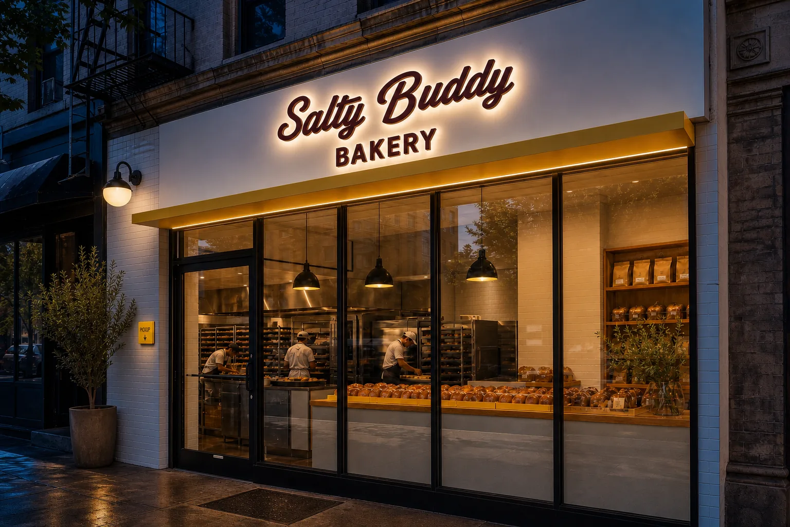
SALTY BUDDY BAKERY storefront with its yellow sign lit on a street corner at night
Key visualSee 4 touchpoints in the details
Case breakdown / 4 touchpointsThe film and 4 touchpointsOpen detailsClose
TODAY'S ROLL CALLFilm / 18.17 sec
The system

Make the oven the headline.

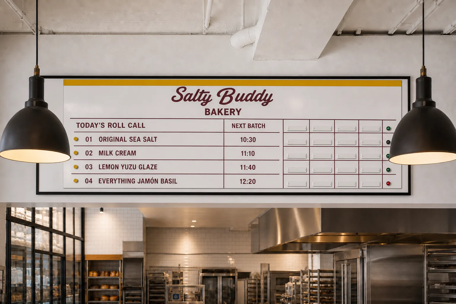
You can choose by baking time before anyone explains the flavours. One board showing today's four rolls and the next batch time is the starting point of the shop, repeated with the same precision in the kitchen, the display, the takeaway bag and the first bite out on the street. The film shows that time actually passing.
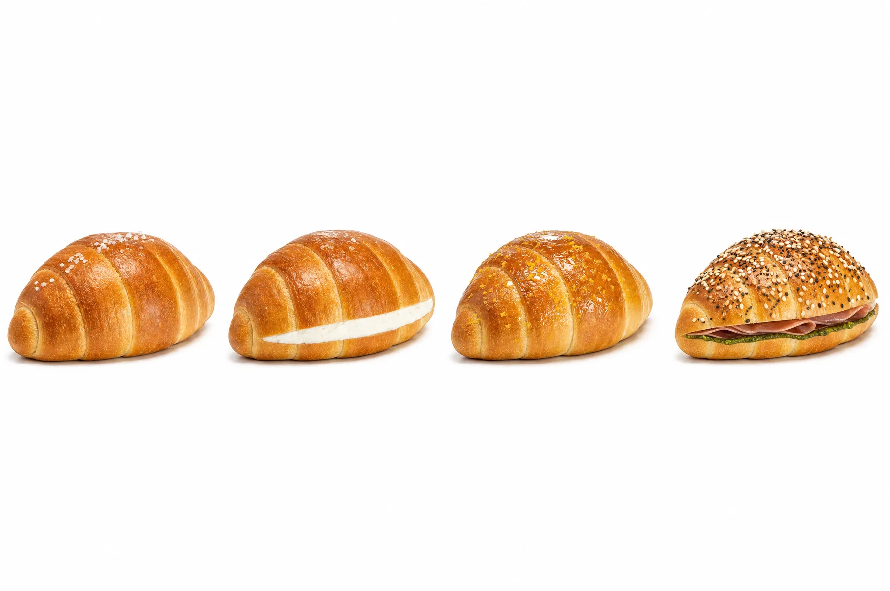
Product line-up of four SALTY BUDDY BAKERY salt rolls on a white background
01 / Product system — four rolls, one silhouette
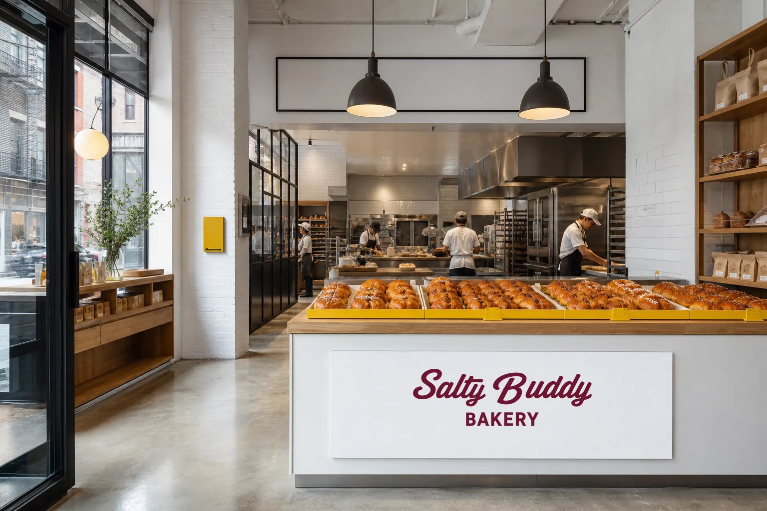
An open kitchen of white tile and stainless steel, with baking in full view from the entrance
02 / Kitchen system — the baking is the display
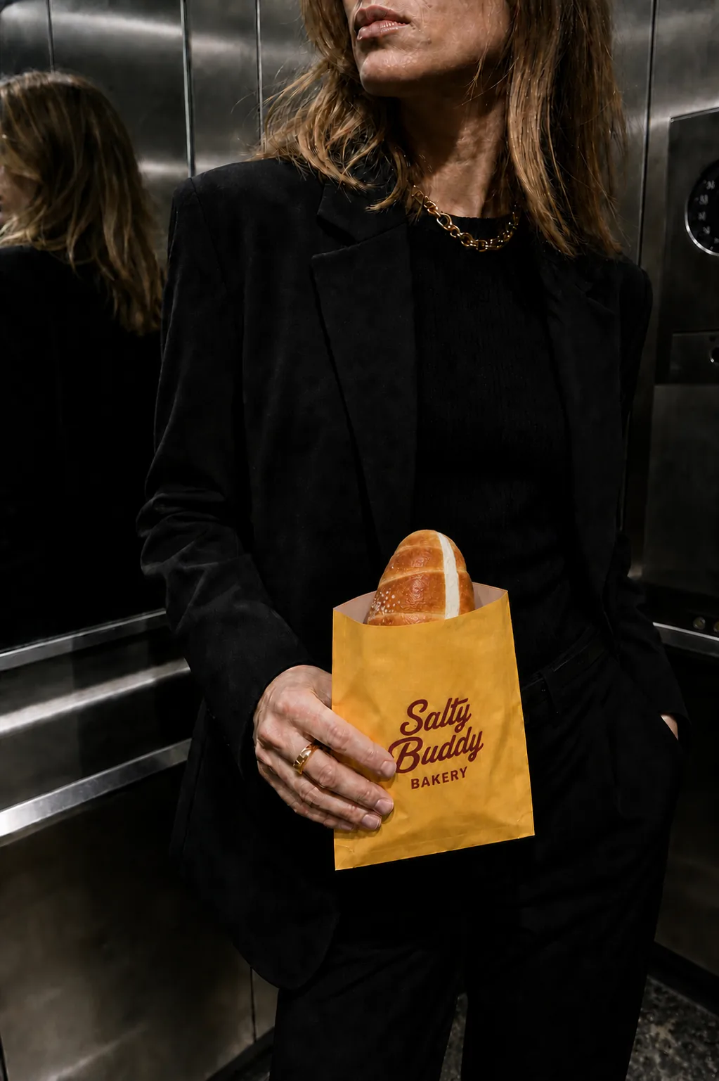
Night flash shot of a person in a stainless-steel lift holding salt bread in a yellow paper bag
03 / Hand — the bag travels the city
A white roll-call board above the open kitchen listing today's four rolls and the next batch time
04 / Roll call — the schedule is the first sentence
02 / Concept work · Basque cheesecake shop

HALF BURNT

Burnt on top, not burnt inside. Serious photos, deliberately clumsy drawings. That contrast is the whole shop.

In shortThe burnt top isn't a flaw. It's the name.

* Not a client project. A demonstration of our brand design method.

brand identitycharacterspackagingspace
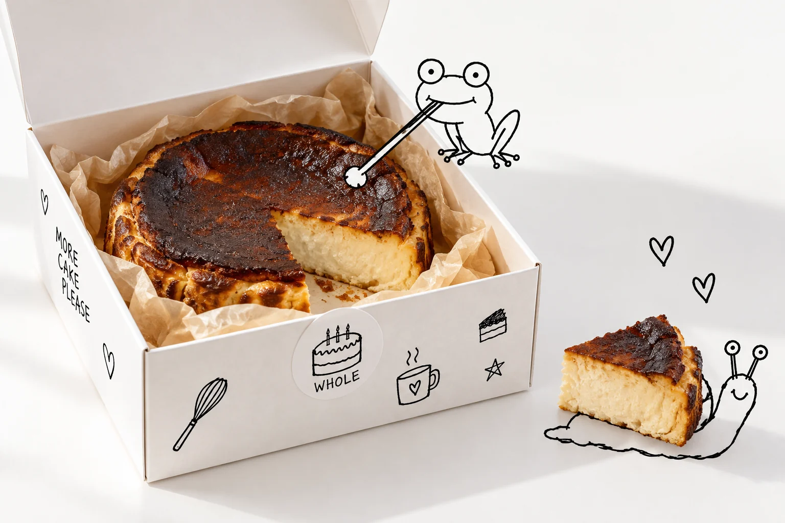
A doodled frog sits on the rim of an open whole-cake box and reaches its tongue toward the cake, while a doodled snail carries off a cut slice
Key visualSee 4 touchpoints in the details
Case breakdown / 4 touchpointsThe film and 4 touchpointsOpen detailsClose
BURNT ON PURPOSEFilm / 18 sec
The brief

Burnt on purpose.

Basque cheesecake is burnt on the surface on purpose. The flaw other cakes hide, this shop puts in its name. The photos show the cross-section honestly on white, and the identity answers with black doodles that look drawn by a five-year-old. All the colour comes from the six flavours' cross-sections. The only colour the brand owns is the pink of its wordmark.

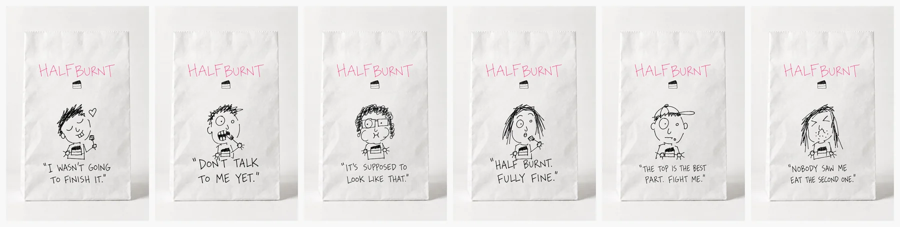
Six white paper bags in a row, each with the pink logo at the top, a regular's face for each flavour in the middle and a one-line quote below
05 / Six regulars, in a row.
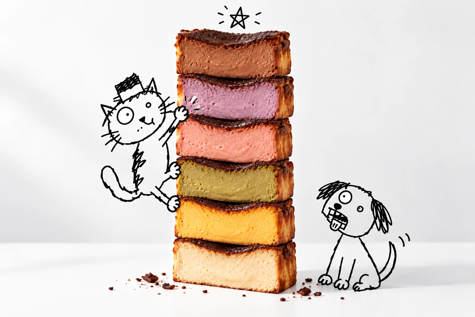
Campaign shot of cubes of cheesecake in six colours stacked into a tower on a white table, with a doodled cat climbing up and a doodled dog looking up with its mouth open
04 / Six flavours, one tower.
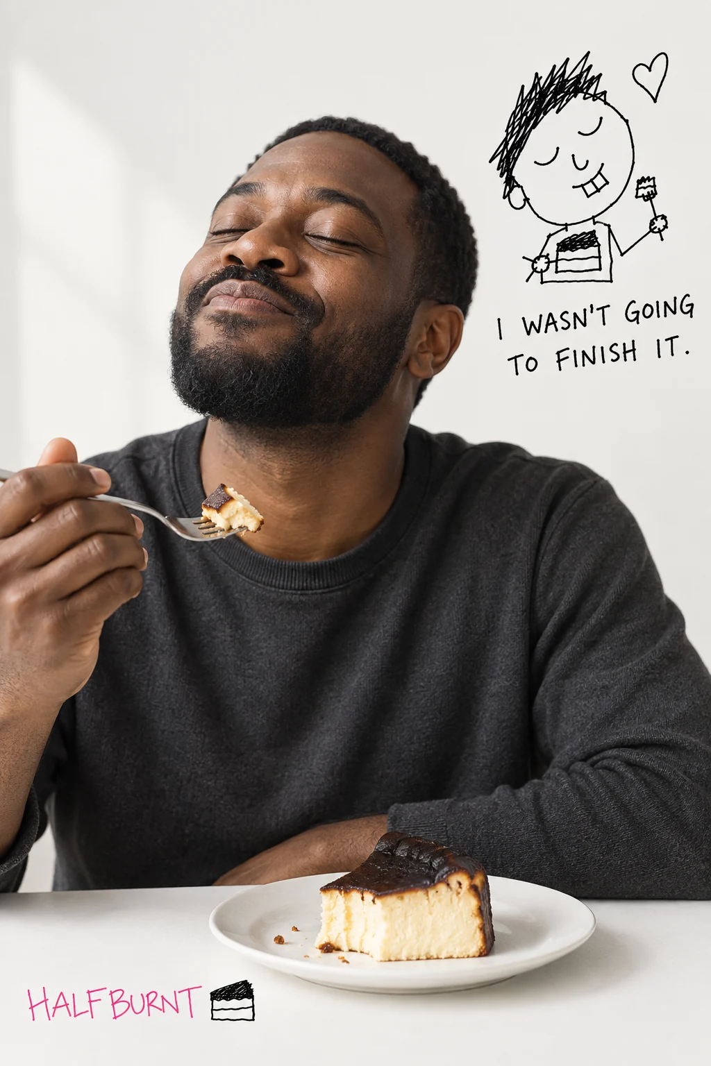
A bearded man in a white studio smiling with his eyes closed and a fork in hand, next to a doodled face
01 / Original — this is your face.
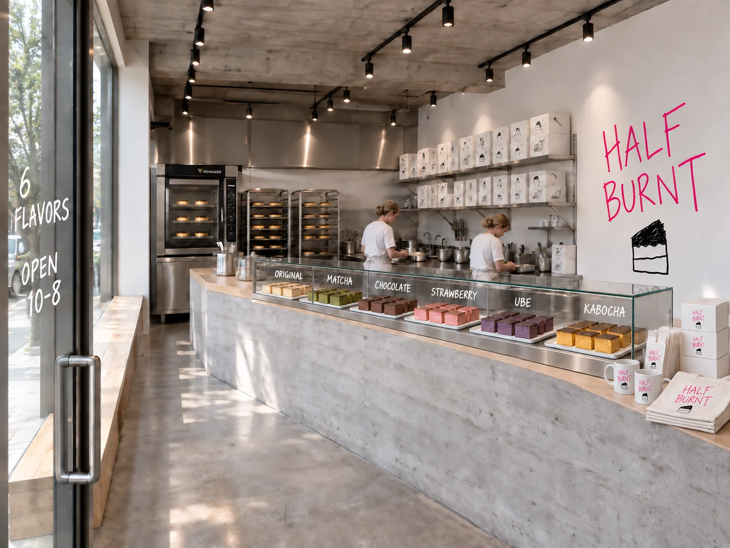
A solid concrete counter with an oak top, slices in six colours in a glass case, a stainless open kitchen behind, and one pink logo on the white wall
System 05 / Space — concrete, oak, one pink word.
03 / Concept work · New York slice shop

NO BIGGIE

In New York, pizza is no big deal. So the brand doesn't make a fuss either. One word, two colours, one shrug.

In shortA no-fuss tone, from the sign to the box.

* Not a client project. A demonstration of our brand design method.

brand systemidentityslice jointfilm
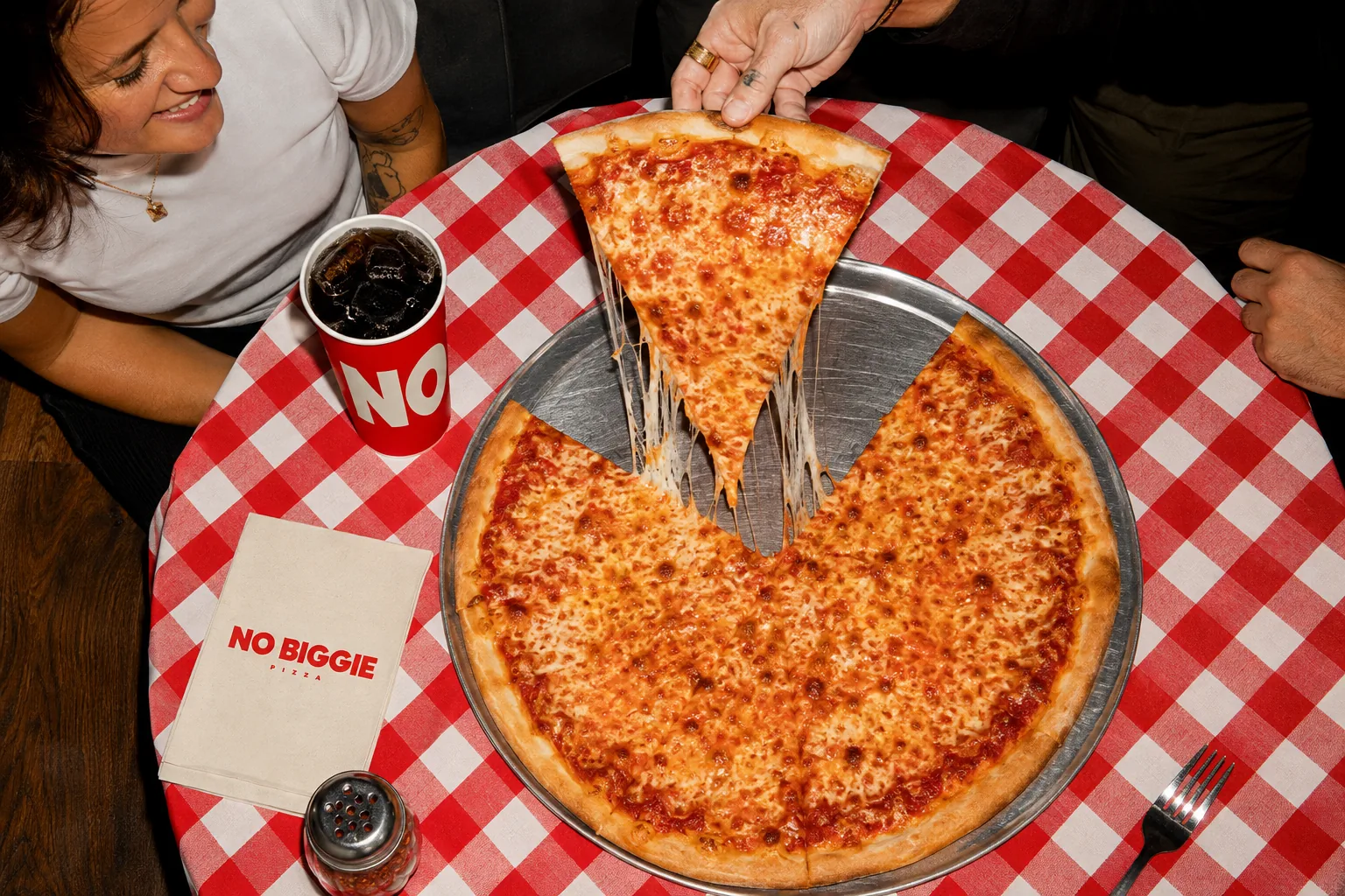
Cheese pizza being served beside a NO BIGGIE cup and box on a red-and-white checked tablecloth
Key visualSee 4 touchpoints in the details
Case breakdown / 4 touchpointsThe film and 4 touchpointsOpen detailsClose
LES, 11 PMFilm / 21 sec
The brief

It's just pizza.

This Lower East Side slice shop never calls its pizza special. The name is one word where “no big deal” meets “big pie”, the logo is one line of heavy sans serif, and the palette is just tomato red and cream. Every line of brand copy ends with a shrug. The personality comes from tone and scale, not from adding more.

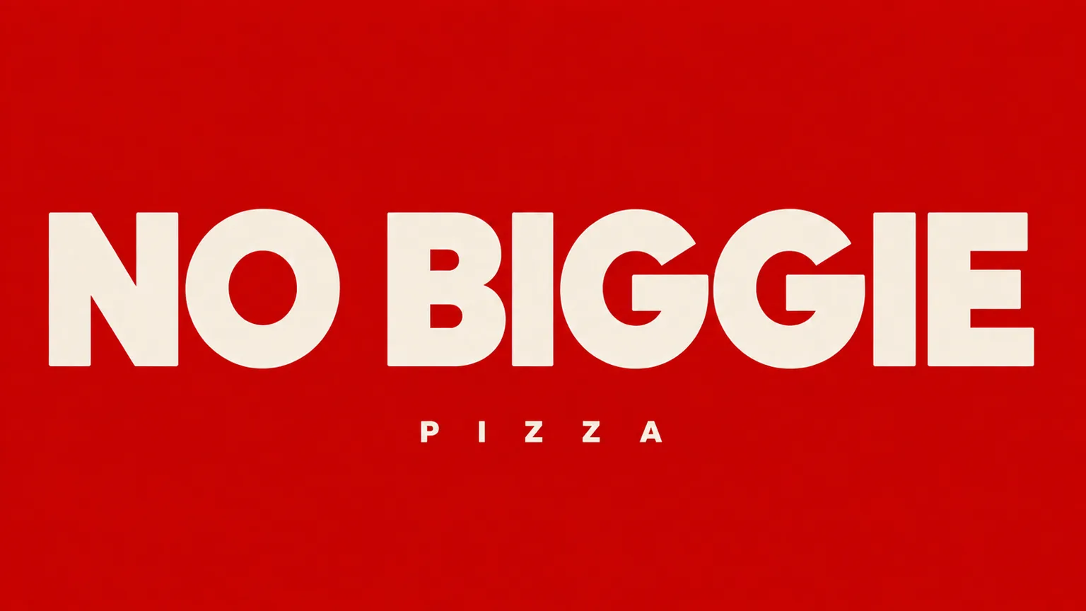
The NO BIGGIE wordmark in heavy cream sans serif on red, with a small, widely spaced PIZZA below
System 01 / Name — no big deal, big pie.
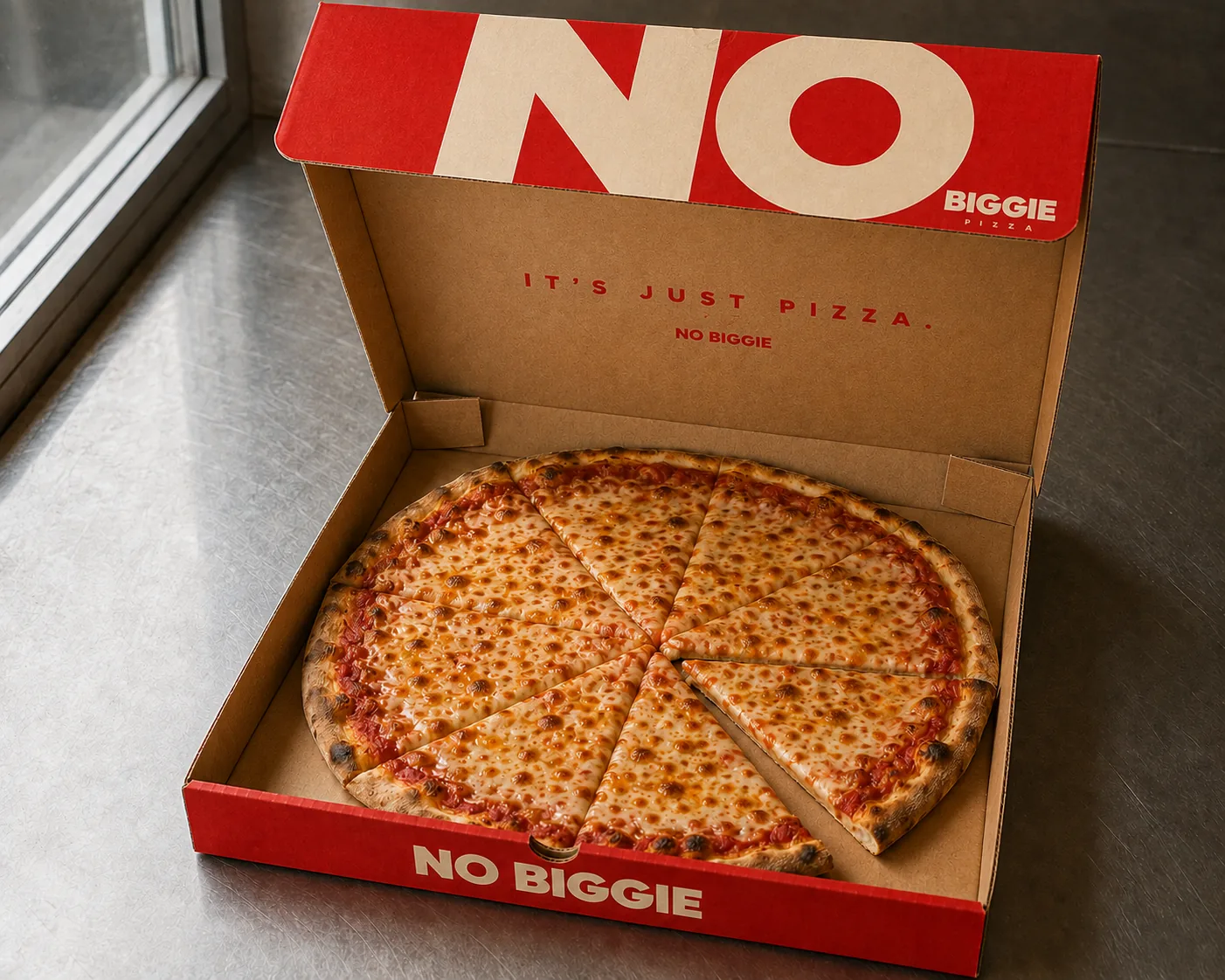
An open red pizza box: a big cream NO on the outside of the lid, plain kraft inside with the red wordmark and the line IT'S JUST PIZZA., and eight slices of cheese pizza
System 02 / Box — NO first, biggie later.
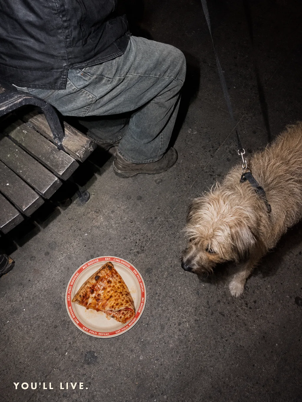
Overhead flash shot of a puppy glaring at a slice on a paper plate on the sidewalk, its owner's legs facing the other way
03 / You'll live.
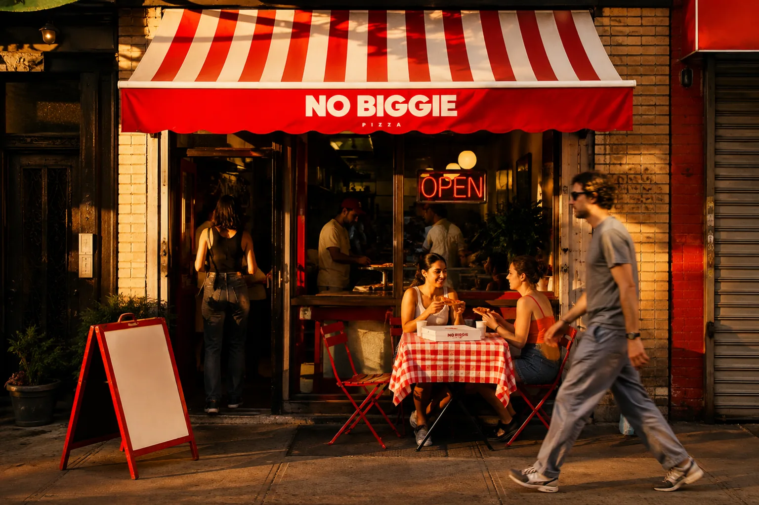
A red-and-cream striped awning with the NO BIGGIE wordmark at golden hour, a red OPEN neon in the window, two people at an outside table and passers-by
07 / Golden hour
04 / Concept work · Frozen protein donuts

DOUGH BETTER

Protein snacks usually look like the gym. We kept the look of a donut and let the numbers speak quietly.

In shortOne line of numbers. The face stays a donut.

* Not a client project. A demonstration of our brand design method.

brand systempackagingfrozen snackfilm
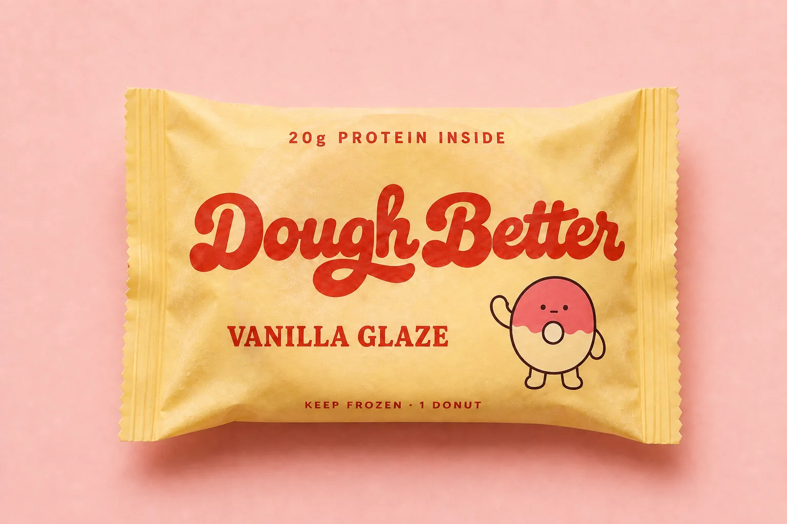
A single vanilla-glaze wrapper in yellow film printed with a red script wordmark and a waving donut mascot
Key visualSee 4 touchpoints in the details
Case breakdown / 4 touchpointsThe film and 4 touchpointsOpen detailsClose
THE COMMUTEFilm / 21 sec
The brief

A donut that's trying.
In 2026, functional snacks have to earn nutritional trust and still feel like a treat. Lose either one and they fail. So the donut is the face of the brand, and the 20 g figure gets a single header line. The name plays on “do better” and “dough”: a donut that decided to try harder.
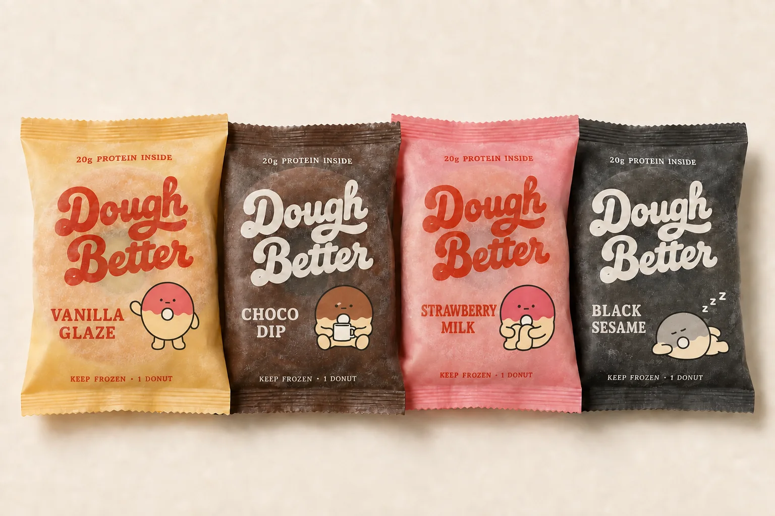
DOUGH BETTER packaging in four flavours
01 / Four flavours, one freezer
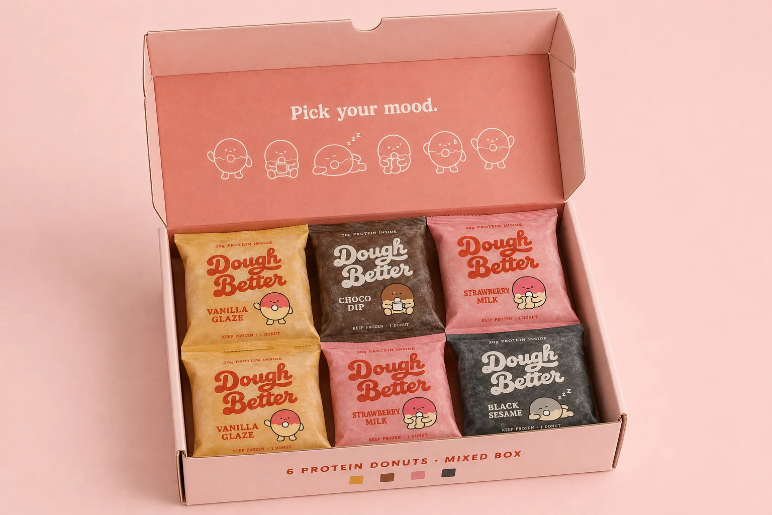
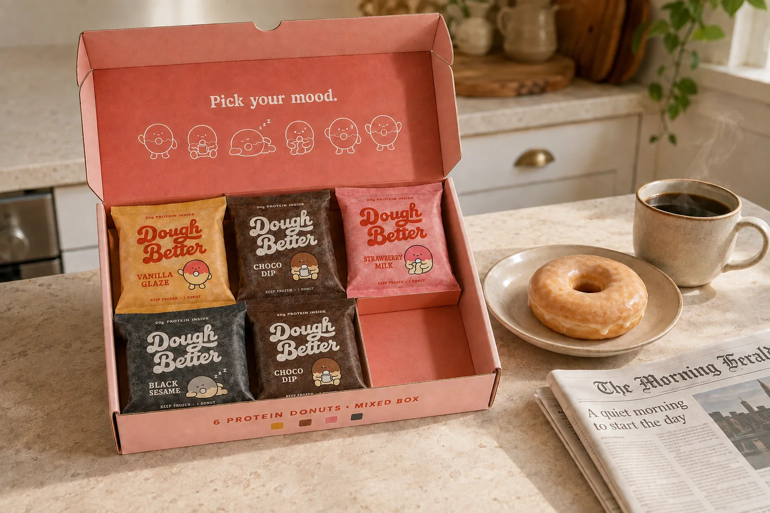
An open six-pack mixed box: Pick your mood. and six mascot poses inside the red lid, and six wrappers in flavour colours
System 03 / Box — pick your mood.
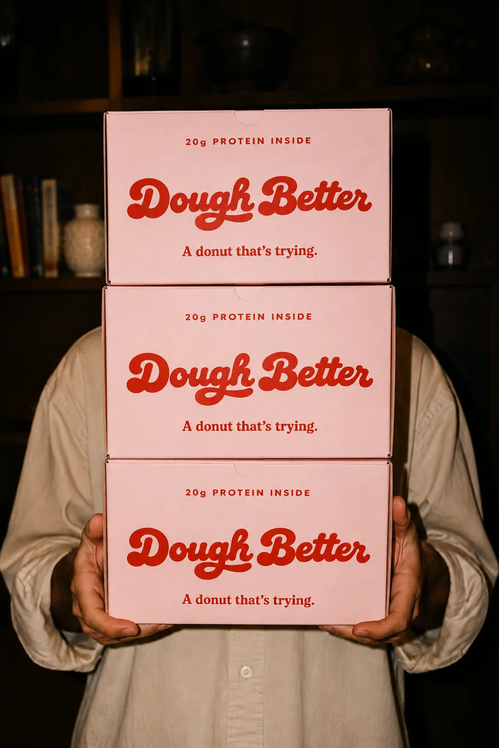
Night indoor flash shot of a person in a beige shirt carrying three stacked blush-pink six-pack boxes that hide their face
System 05 / Carry — three boxes, no face.
An open six-pack box on a kitchen counter in the morning: five wrappers and one empty slot, with a donut on a plate and coffee
04 / One slot empty
05 / Concept work · New York specialty coffee

UNUSUAL

Instead of adding seats, we used the sidewalk as the shop. Here the brand's face is not the interior but the people standing out front.

In shortNo more seats. The sidewalk is the shop.

* Not a client project. A demonstration of our brand design method.

brand systemcoffeespace-ledfilm
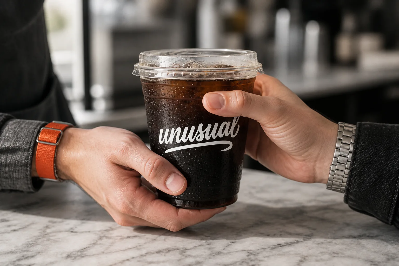
The moment a cup passes from hand to hand across the counter
Key visualSee 4 touchpoints in the details
Case breakdown / 4 touchpointsThe film and 4 touchpointsOpen detailsClose
MOSTLY STANDINGFilm / 15 sec
The brief

The shop is the sidewalk.

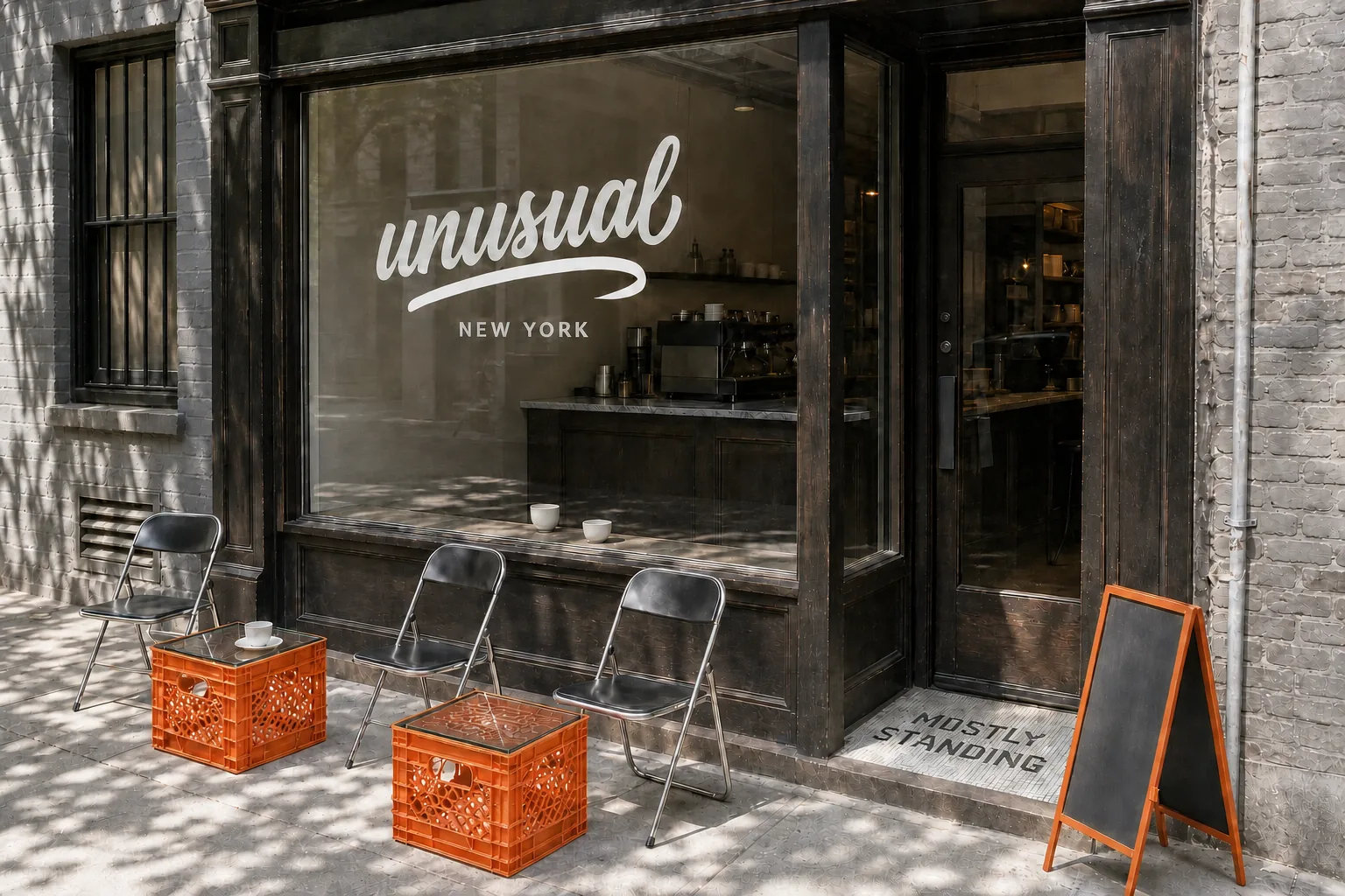
Adding seats on a narrow Manhattan lot is a fight you can't win. So we swapped seats for a bench and a wide window ledge, and let customers spill out onto the alley and sidewalk. The shop's first impression is not the interior but the scene outside the door.

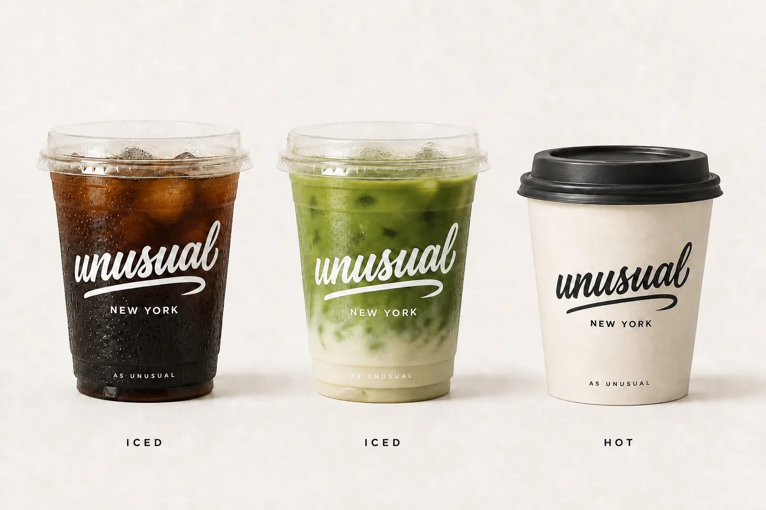
Takeaway set of off-white cups and sleeves with a charcoal wordmark and an orange accent
System 03 / Carry — orange is a thing, not a logo.
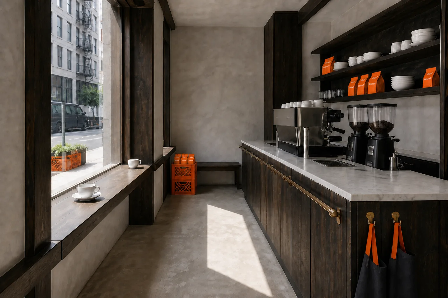
A long, narrow interior of dark-stained wood and marble bench tops, with the counter on the right, the window ledge on the left and a corridor down the middle
System 01 / Room — one corridor, two edges.
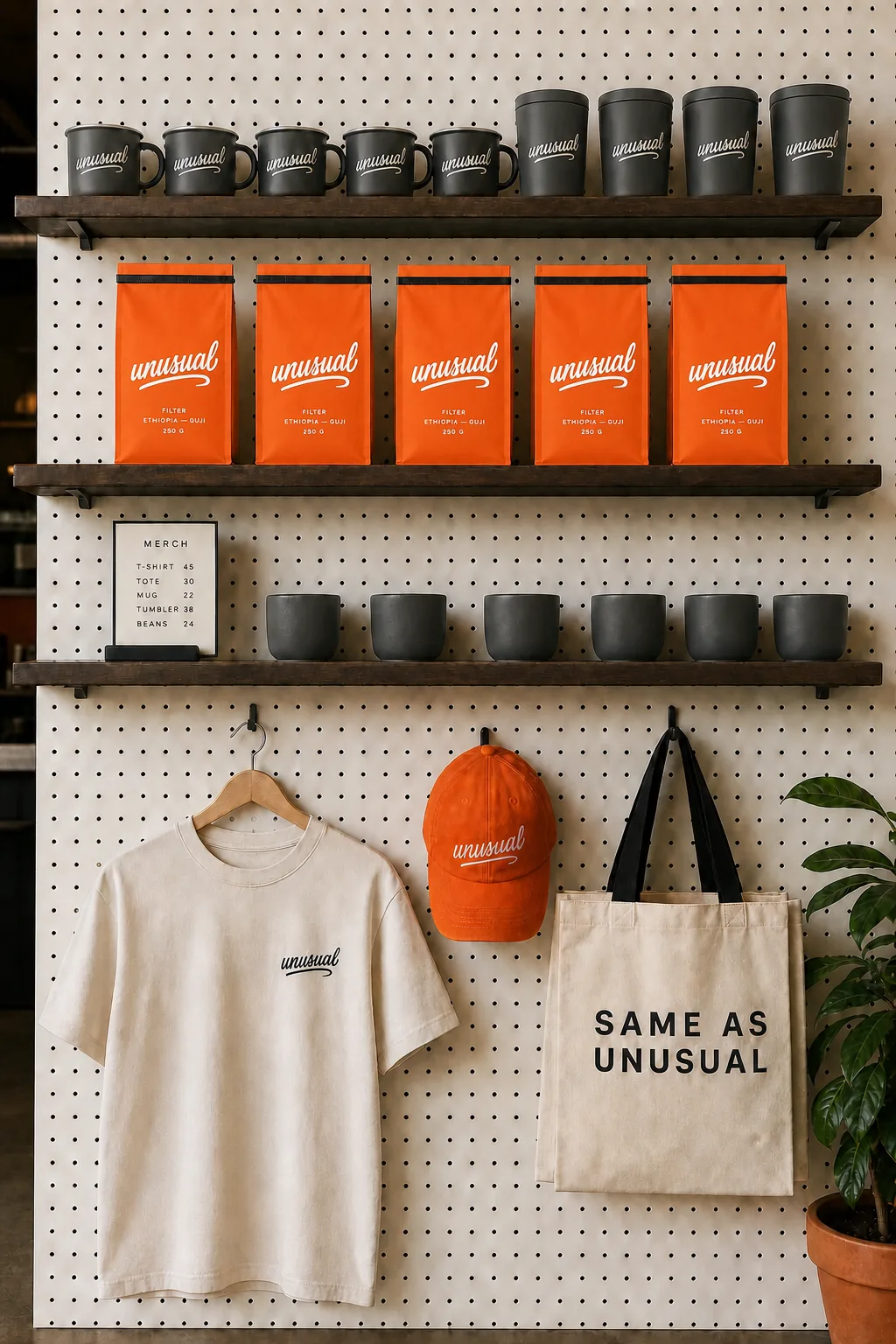
The merch wall inside: tees, totes, caps and bean bags hung on a charcoal wooden wall
System 04 / Words — as unusual.
A narrow Manhattan coffee bar with a charcoal facade: the unusual wordmark on the glass, an orange-framed A-board by the door and orange milk crates on the sidewalk
01 / The face is the front step
06 / Concept work · Neighborhood matcha shop

OKAY, MATCHA.

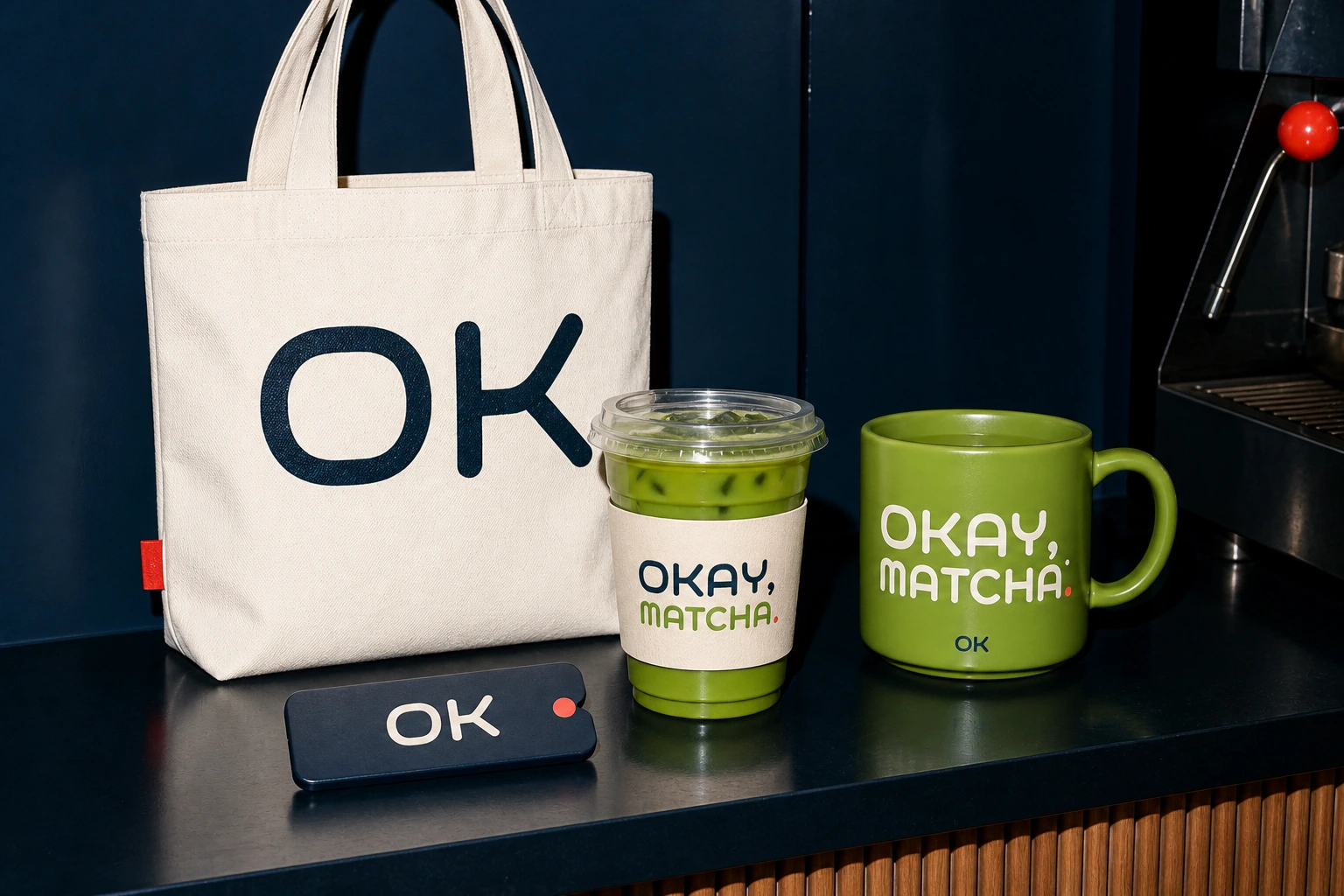
Not a logo for one cup of matcha, but a neighbourhood brand system that repeats through ordering, the space, the street and the movement of hands.

In shortThe same signal, from the order to the street corner.

* Not a client project. A demonstration of our brand design method.

brand systemf&banchor-ledfilm
OKAY MATCHA products and goods: a tote, iced matcha, a mug and an order tab
Key visualSee 4 touchpoints in the details
Case breakdown / 4 touchpointsThe film and 4 touchpointsOpen detailsClose
ONE CUP, ALL DAY.Film / 17.5 sec
The brief

Make matcha feel repeatable.

Instead of showing only a good cup, we let people meet the same signal every day. Ordering, taking it away, or walking past the shop, it reads as the same brand.

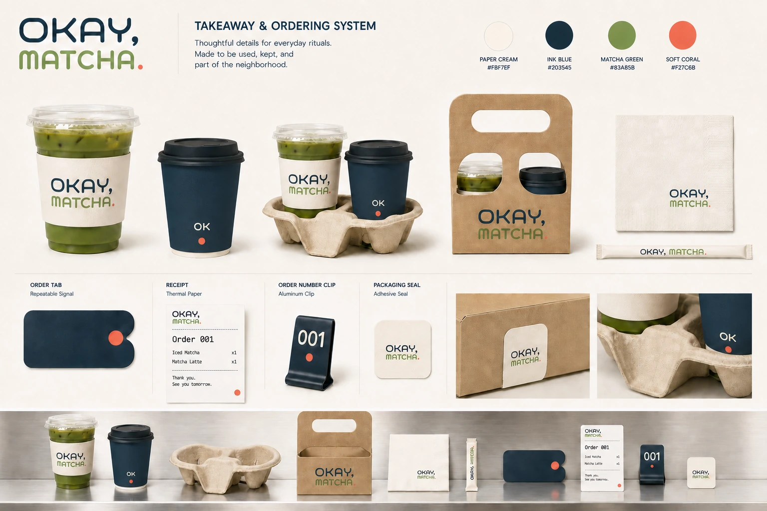
OKAY MATCHA takeaway and ordering set: an iced cup, an Ink Blue hot cup, a carrier and an order card
System 01 / Order — one cup, many signals.
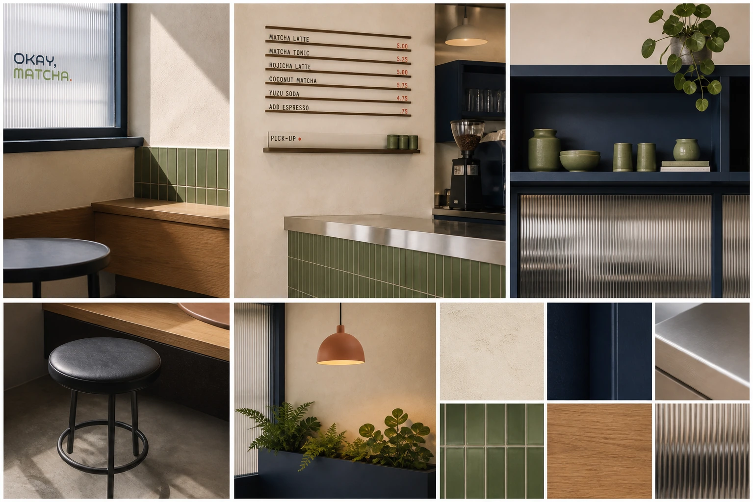
OKAY MATCHA interior details: Paper Cream walls, Ink Blue joinery, Matcha Green tiles and brushed stainless steel
System 02 / Space — a room you recognize.
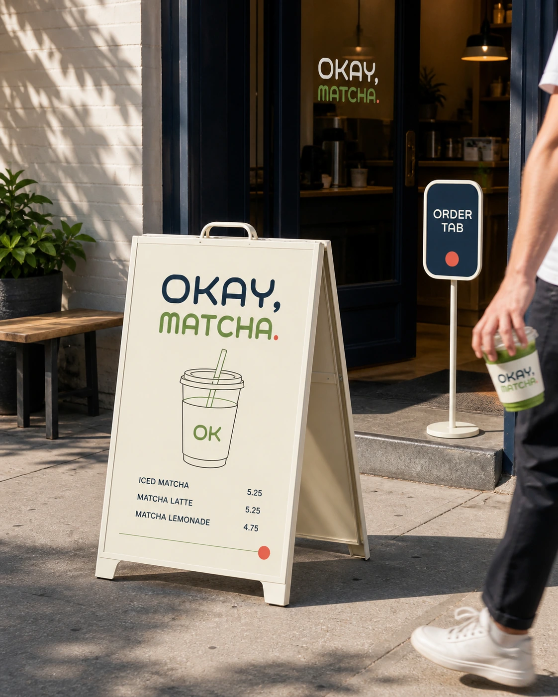
The A-frame and ORDER TAB sign outside OKAY MATCHA
04 / Order tab
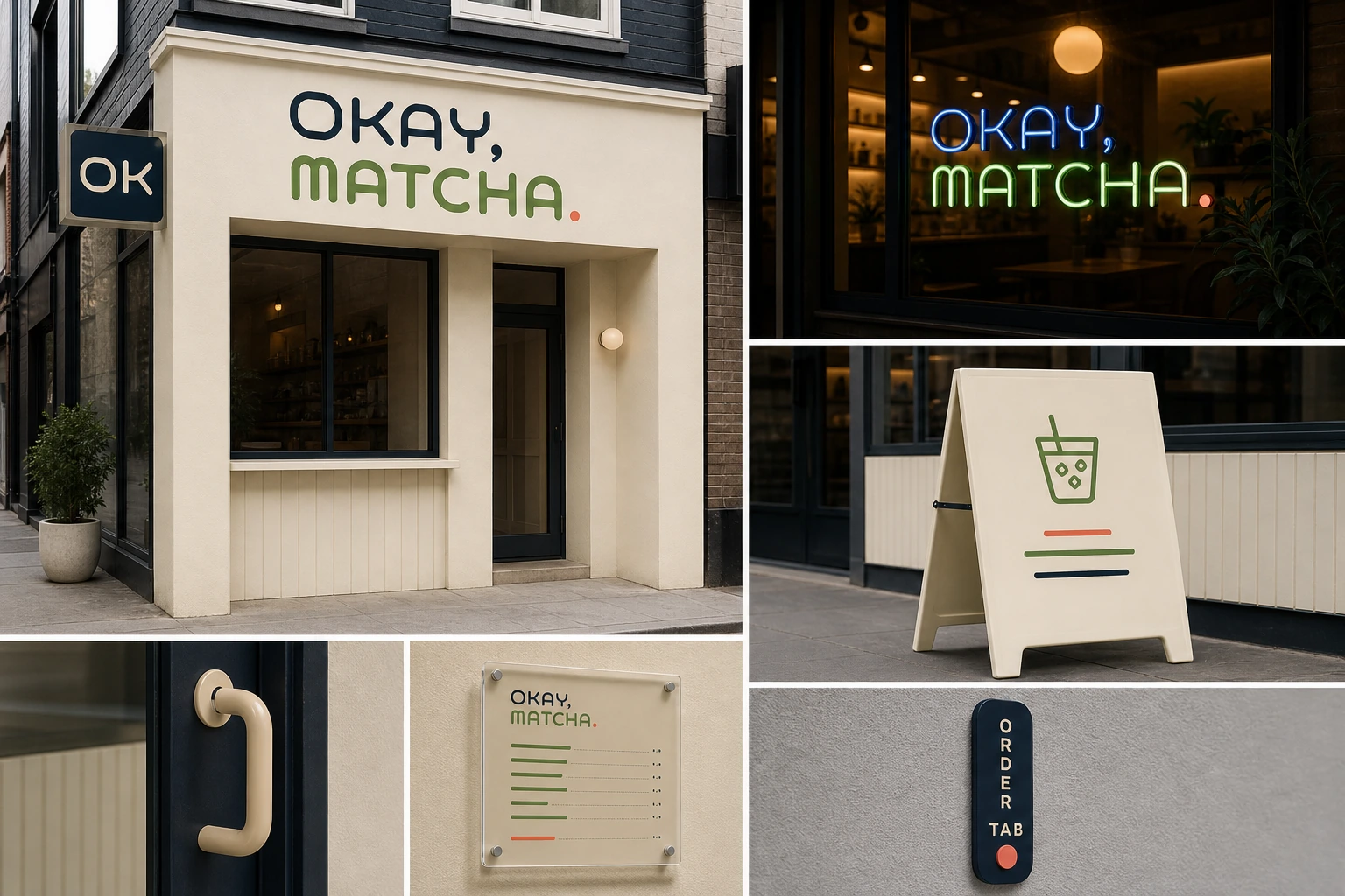
OKAY MATCHA exterior signage: the wall wordmark, a neon sign and an A-frame board
System 03 / Signage — the same signal outside.
07 / Concept work · Sleep night latte

SNOOZE CLUB

The sleep market is full of pastels and whispers. We went the other way: a club where sleeping well is something to show off.

In shortSleeping well is the membership card.

* Not a client project. A demonstration of our brand design method.

brand systempackagingsleep wellness
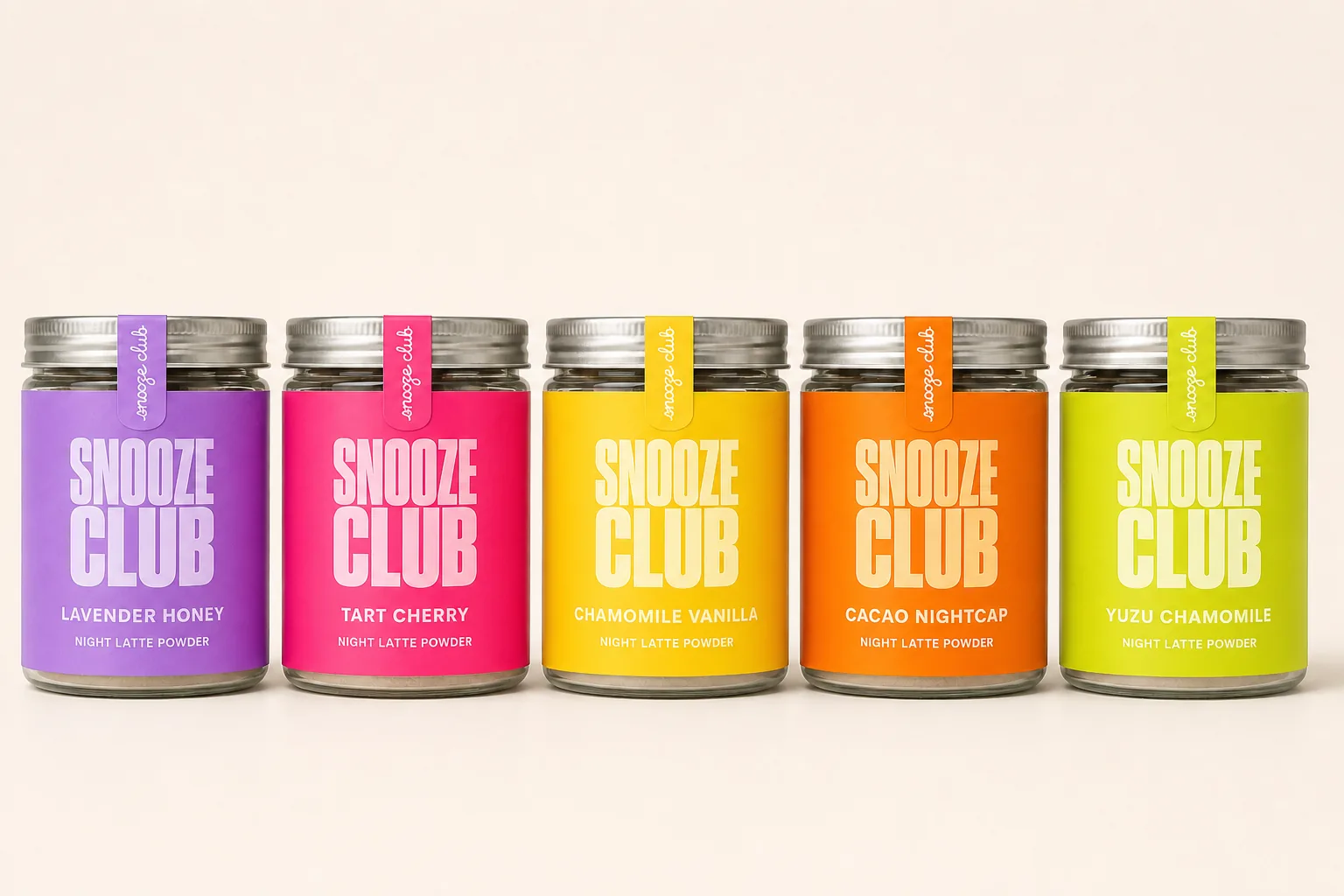
SNOOZE CLUB glass jars in five colours on cream: lilac, cherry pink, amber, orange and citron labels, with aluminium lids and neck tags
Key visual / flavour wallSee 4 touchpoints in the details
Case breakdown / 4 touchpoints4 touchpointsOpen detailsClose
The brief

Falling asleep is the membership.

Sleep supplements always look apologetic. We brought the rainbow-shelf language of flavoured coffee into the night and turned a magnesium night latte into a five-colour flavour club. Each jar is its own vivid colour; lined up, they make one wall. The copy and the scenes carry the night, not the colours.

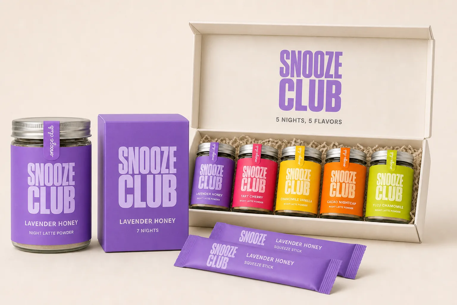
Full line-up hero: a lilac jar, a 7 Nights carton, two sticks and an open sampler kit
System 01 / Range — one label, four formats.
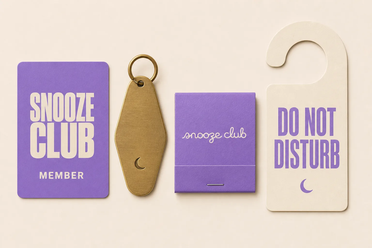
Flat lay of membership items: a lilac member card, a brass key tag stamped with a crescent moon, a script matchbook and a DO NOT DISTURB door hanger
System 02 / Club — the brand is a membership.
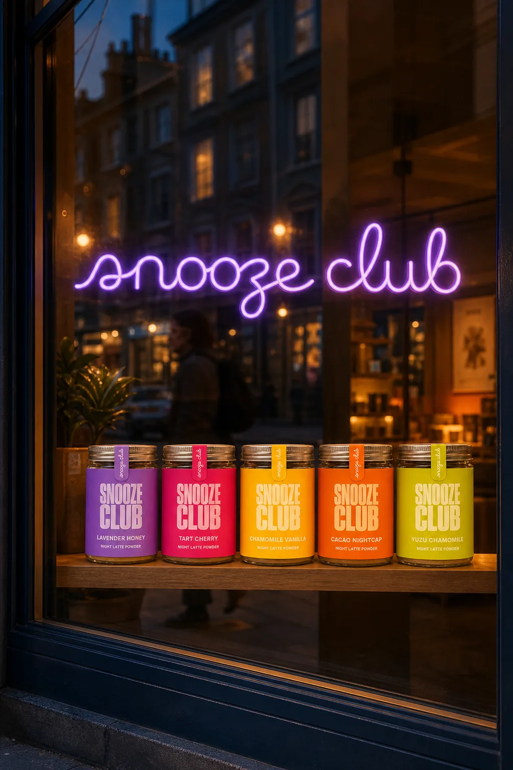
A shop window at blue hour: five colours of jars under a lilac neon script, with passers-by reflected in the glass
System 04 / Street — lights on at lights out.
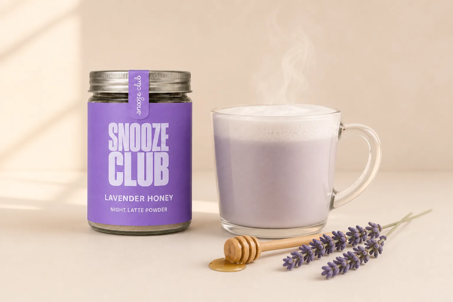
A steaming lavender latte next to a jar of lavender honey, with a honey dipper, lavender sprigs and evening window light
System 03 / Cup — purple you can drink.